#> Loading required package: shiny
#>
#> This is analyzeBehaviorspace version 1.3.0Getting Started
Install NetLogo
First, download and install NetLogo from https://ccl.northwestern.edu/netlogo/download.shtml. NetLogo is available for Windows, MacOS, and Linux. Follow the installation instructions for your operating system on the Download page.
Running a BehaviorSpace Experiment
The analyzeBehaviorspace package analyzes output from a
NetLogo BehaviorSpace experiment, so to use this package we first need
to create a BehaviorSpace experiment in NetLogo and run it.
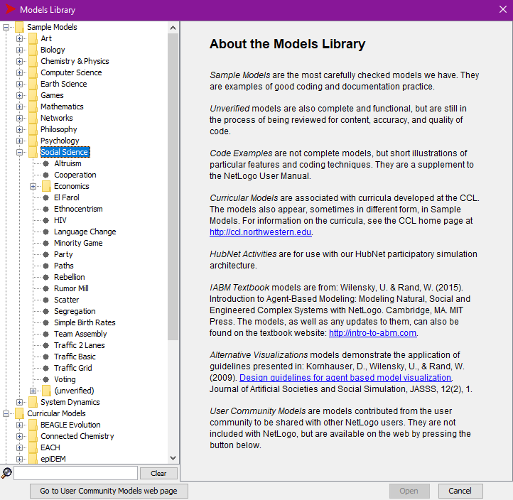
Start NetLogo, open the File menu, and select
Models Library. This should open a window for selecting a
model. You should see a list of model topics under the heading
Sample Models. If you don’t, click on
Sample Models to expand the topic list. Click on
Social Science and then click on Segregation
to open the housing segregation model.
The segregation model is a famous model created by Thomas Schelling in the late 1960s to study housing segregation. You can read more about it in Schelling’s book, Micromotives and Macrobehavior, but here we’re just going to use it to examine the way that varying two parameters affects the stability of the model.
In this model, there are 2601 squares and the model is set up with
roughly equal numbers of orange and blue turtles occupying a certain
percentage of those squares (this percentage is represented by the
variable density).
Turtles are labeled happy or
unhappy depending on the fraction of the turtles on
neighboring patches that are the same color as they are. Each turtle
looks at the turtles on neighboring patches and calculates the
percentage of these that are the same color as itself. If this
percentage is greater or equal to the variable
%-similar-wanted the turtle is happy and if the percentage
is less, then it is unhappy.
At each tick, all happy turtles stay where they are and each of the unhappy ones moves to a random vacant patch. The model keeps track of the number of happy and unhappy turtles, as well as the average percentage of same-color neighbors across all of the turtles. The model and keeps running until there are no unhappy turtles.
For the BehaviorSpace experiment, we will vary the two variables
density and %-similar-wanted and monitor the
average fraction of similar neighbors and the percentage of turtles that
are unhappy.
In order to keep the run time under control, we will limit the model to run for no more than 200 ticks.
Open BehaviorSpace by clicking on the Tools menu and
selecting BehaviorSpace. Then click on the New
button to create a new BehaviorSpace experiment. Fill in the experiment
following the picture below:
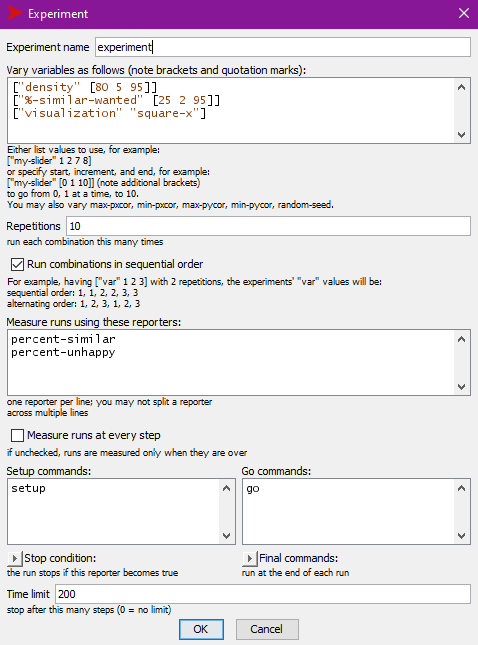
This experiment will vary density from 80% to 95% in
steps of 5% and vary %-similar-wanted from 25% to 95% in
steps of 2%. It will run the model 10 times for each configuration.
Measuring at every step of the model runs will create enormous data
files and for this example, we only want to know how long it takes the
model to finish running, so un-check
Measure runs at every step in order to only record the
model output values for the end of the run.
This experiment will run the model until it either stops on its own
or reaches 200 ticks. At the last tick (when the model stops), it will
record the values of two of the model’s reporters:
percent-similar and percent-unhappy.
Click on the OK button to save the experiment and then
click Run to run it. You will need to configure the run to
generate the required output:
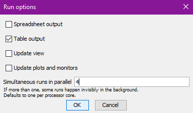
Check Table output, uncheck Update view and
Update plots and monitors. Experiments run much faster if
they don’t have to update the model displays. Under
Simultaneous runs in parallel NetLogo will make a good
guess, based on your computer’s hardware and it’s best to accept this
default value.
Now click on the OK button. BehaviorSpace will ask you
to give it a filename for saving your experiment’s results (the default
will be Segregation experiment-table.csv). Give it a file
name and then let the experiment run (this may take some time).
Now you’re ready to run analyzeBehaviorspace.
Running analyzeBehaviorspace
In an R session, load the analyzeBehaviorspace library and launch an
analyzeBehaviorspace shiny application:
library(analyzeBehaviorspace)

launch_abs()
When the application launches, it will open a web browser window where you can load your data file and analyze the data.
Under Choose csv file, click the Browse...
button and choose the file you saved from BehaviorSpace (by default,
this is Segregation experiment-table.csv). After the file
finishes loading, you should see something like this:
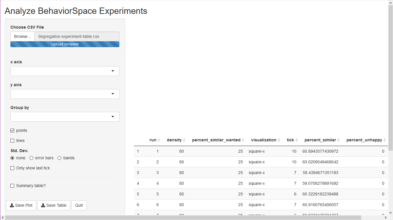
There is a table at the bottom right with the outputs from the
experimental run. You are now ready to start graphing the results. Using
the selectors for the plot, choose percent-similar-wanted
for the x-axis, and tick for the y-axis.
Check both points and lines. You will see the
number of ticks the model took to make all the turtles happy, or 200
ticks for runs when the model ran out of time. The values indicated by
the dots are the average for the 10 model runs at each value of
percent-similar-wanted (in the original model, the variable
was called %-similar-wanted, but analyzeBehaviorspace
translates many common symbols to words).
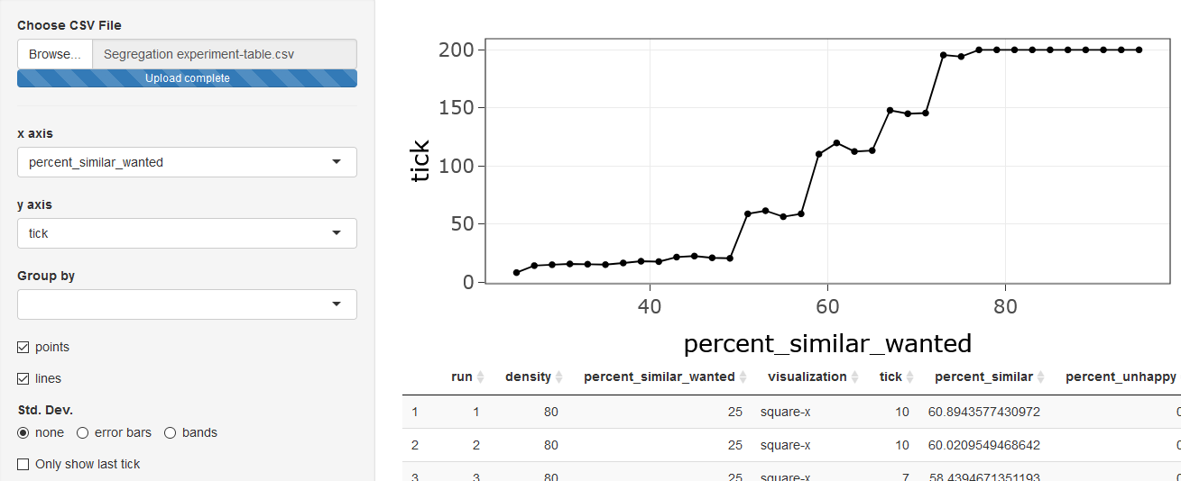
This shows us that for percent-similar-wanted less than
about 50%, the model converges quickly to a state where every turtle is
happy, and that the time it takes to converge does not change very much
as percent-similar-wanted increases. Above 50%, increasing
percent-similar-wanted causes large increases in the time
to converge until around 77%, where the model does not converge by 200
ticks.
Suppose we want to get a sense of the amount of variation from one
model run to another for each value of
percent-similar-wanted? We can tick error bars
or bands under the Std. Dev. options. This
will display either error bars around the points or bands above and
below the lines, indicating one standard deviation above and below the
average values.

We see that there is very little variation from run to run below 50%
and above 75%, but that between 50% and 75%, there is a lot of
run-to-run variation. A lot of this variation happens because for each
value of percent-similar-wanted, we varied
density from 80% to 95%. We can display each value of
density separately if we use the Group by
option to select density. This will display the model
output for each value of density in a different color:
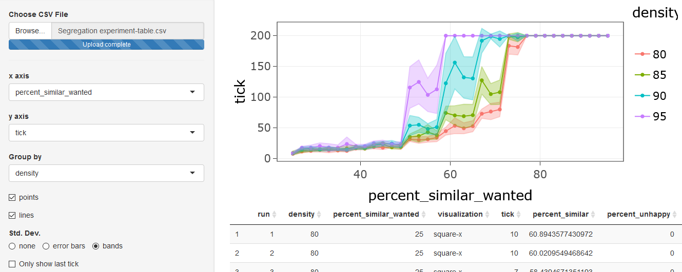
Now we can see that the value of percent-similar-wanted
at which the time to converge begins to rise and the value at which the
model reaches 200 ticks without converging both depend strongly on the
density of occupied patches. The greater the density, the lower the
value of percent-similar-wanted at which it becomes
difficult to satisfy all the turtles.
We also see that the range of values for
percent-similar-wanted for which there is considerable
variation from run to run is much smaller when we consider each value of
density separately.
Renaming variables
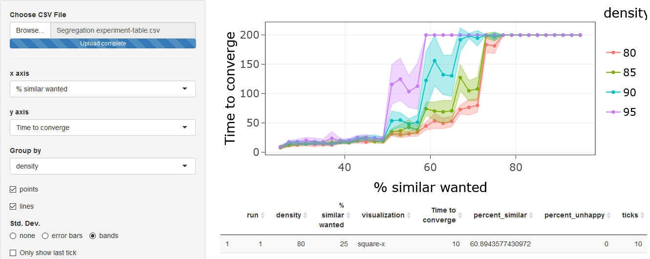
If you want your plot to look prettier, you can rename variables in
your data and the plot will reflect the new names: Scroll down to
Rename variables, select
percent-similar-wanted, type % similar wanted
in the to box, and click on the Rename button.
Next, select tick, type Time to converge in
to and click Rename. The graph will now look
like this:
Saving Output
If you want to save the results of your analysis, either as images of
the graphs or as tables of numbers that you can read into Excel, R, or
another program for further analysis, you can scroll down to the
Save Plot and Save Table buttons on the left.
Save Plot will save the current plot as a .png
image file. Save Table will save the table of data as a
.csv file.
If you check Summary table, then the table you save will
correspond to the data plotted in the figure (with averages and standard
deviations for the y-axis variable at each value of the
x-axis and grouping variables). If Summary table
is not checked, then you will save a .csv file with the
values of all the variables. In either case, the table displayed in the
lower right of the screen shows the data that will be saved.